cards, Catalogues, Classes

WOLLONGONG PEOPLE – COME ALONG AND “COLOUR YOUR WORLD!”

See all the amazing new colours along with the gorgeous new products at my ‘Colour Your World’ Catalogue Showcase.  Places are filling fast. 

There are 3 time sessions.  
Friday 8th June – 7pm
Saturday 9th June – 2pm
Tuesday 12th June – 7pm.

COST: $10

WHERE: For local Wollongong people.  Come and join in.

RSVP: Wednesday 6th June or by Sunday 10th for the Tuesday session.

Looking forward to seeing you there.

Jenny

cards, Catalogues, Stampin' Up!

GET TO KNOW THE 2018 INCOLORS!

Well what an exciting day yesterday was with the start of the 2018 Stampin’ Up! Catalogue.  I hope you have had time to look over it and maybe even made up your Wish List.  I hope you have a BIG piece of paper for that. Perhaps a notebook would be better. 😉

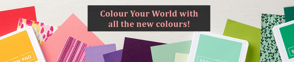
For today I thought we would chat about the new Incolors.  Let’s meet them.

I must say, they are quite bright Incolors this year.  I don’t often work with a lot of bright colours and I wasn’t too sure of them.  They are growing on me though and I think if you aren’t too sure then just use them in small doses on a card and maybe not try and use all of them together.  (That’s my solution anyway. 😉 )

I made up a set of cards using these colours.

It’s hard to see them all when there are so many. I have each one below. I used the Love What You Do stamp set and the new Stitched Labels Framelits.  Love! Love! Love! these.  If you love the Stitched Shapes Framelits you will love these.

It’s good to see a Colour Comparison to see how the Incolors compare to other colours.  Each year I do a Punch chart to show them and have it in my studio.  Every one who comes to classes likes to see the differences in the colours we use.  I know I could probably do a fancy, schmancy computer generated one but where is the fun in that – and I don’t have time!!  I know it’s not the most professional or quality presentation but we are about punching cardstock and sticking them on paper. 😉

Here are the comparisons.  What do you think of the colours? What is your favourite Incolor this year?

Let’s talk about each of the colours.

Grapefruit Grove

I have to say this is fast becoming a favourite colour.  I have used it quite a bit already.  It’s a nice soft peach colour, a little lighter than Calypso Coral which I have used a lot of. It does work well with a lot of current colours.

HOW TO ON THE CARDS:  Each card layout is the same so I will just give the details here. The “stitched” effect was cut on a piece of the coloured card and then cut with an Oval from the Layering Ovals Framelits. You might notice along the bottom edge of the white on each of the cards is a different “stitched” effect either straight “stitches” or xxx “stitches”.  It is hard to see.  I had a couple of attempts to cut these and found that I would get an ‘edge line’ from the Framelit which annoyed me.  I ended up using the foam mat as the top plate on the Big Shot and found that reduced the line.  I was happy with that.

The flower was stamped in the ink colour and then lightly washed over with the Aquapainter. It was then hand cut with scissors.

Call Me Clover

A bright green colour which might work great at Christmas time.  It is much lighter than a few of the current greens.

Blueberry Bushel

I am liking this shade of blue.  It’s not such a dark shade like the Night of Navy but not so “bright” which is a good addition to the blues.  I think it will work well for Masculine cards.

Pineapple Punch

I have had a number of people say to me how they love this colour.  Actually it was chosen as one of their favourite colours of all the colours.  It wasn’t just one person either.  So obviously it is a great addition.  A bit more “truer” yellow perhaps.  Warning: wear your sunglasses while looking at it. 😉

Lovely Lipstick

A bit darker pink to Melon Mambo.  A number of people have said they really like this colour too.  I think this is a little lighter than Berry Burst if you are comparing them too.  It’s a nice pink.

—-

So there are all your 2018-2020 Incolors.  I am sure you will see a lot of these colours over the next 2 years.  I hope you get to play with these colours too.

Have a great weekend,

Jenny


cards, Catalogues, Stampin' Up!, swaps

PEACEFUL REFLECTION Z-FOLD!

Last weekend our larger team had a stamp day together.  We had a Shoebox Swap.  Have you ever tried one of those?  Each person made a card and then made up kits for each person to make that card.  The kits and inks and everything needed was put in a box/container.  Then we passed the boxes around the table to complete each card.  I have to say it was a frenzy at times.  We made 13 cards in 4 hours.  We had about 20 minutes for each card.  It was a fun way to make some cards up in a short time though.

I will show you the cards over the next days and weeks.  Many were with exciting new products which was great.  Today I thought I would show you my card for the Shoebox Swap.

I received the Peaceful Reflection set at Onstage last month as Prize Patrol.  I have to say I was at a bit of a loss with it but I have played with it a bit over the last couple of weeks.  If you are on my Facebook page you might have seen a little sneak of them.  (Head over to ‘Like’ my page if you haven’t already.  The link is in the right hand side bar).

This is my card.

This is a version of the Z-fold cards.  It is very easy to do.  Cut your card base to your standard card size.  Then score halfway on the front panel.  Fold back on the score line.  Easy as!! 🙂

I used Bermuda Bay, Pool Party and Berry Burst and used a number of different stamps to create the image.  If you haven’t seen this set yet I think you will like it.  So fun to make up your images with different flowers, dragonfly and ripples.  There are so many other ways to use it too which I will show you over the next couple of weeks.

The Pool Party strip is embossed with one of the folders in the Petal Pair Embossing Folder pack.

I stamped the inside with 2 dragonflies.  Also this set is a 2-step stamp set so you have the outline of the dragonfly and then the solid shape to fill in it’s wings.  The sentiment is from Petal Palette.

You can’t tell in the photo but I used the Wink Of Stella clear brush to add a little sparkle to the Dragonfly wings on the front and inside.

Stay tuned for some more cards from our team stamp day.

Jenny

cards, Catalogues, Stampin' Up!, Videos

SEE THE SHARE WHAT YOU LOVE UP CLOSE FOR WEDNESDAY’S WOW! #24!

I told you about the gorgeous Share What You Love Suite yesterday.  You saw photos but that really doesn’t show the shine in these products.  So today for Wednesday’s WOW! #24 I have a video for you from Stampin’ Up!  Be sure to catch that shimmer in the paper and those doilies.  They are really just stunning!

After you catch the video.  Head back to yesterday’s post so you can see all the contents again in each bundle.  And there is the ordering information there too with a bonus tutorial for 2 cards if you order any of these bundles this month.  So sit back and watch for that shimmer.


Before you head off I just wanted to show you another card with this gorgeous suite.  This card is one of the cards we made at Onstage early last month.

Thanks for visiting today.  I will be back again soon,

Jenny

Catalogues, Stampin' Up!

ORDER YOUR STAMPIN’ UP! CATALOGUE NOW!

YES! It’s that time.  The 2018 Stampin’ Up! Catalogue starts on June 1st.  There is SO much gorgeousness inside.  There really is! I would love you to see it and have your own copy.  Yes, you will be able to view it online BUT there is nothing like flicking through the pages AND you can’t stick post-it notes on the computer screen right!!. 😉

If you are an Australian resident AND you don’t have a current Stampin’ Up! Demonstrator to take care of you then grab a copy from me.

ORDER YOUR CATALOGUE:

Head -> HERE and fill out the form

OR

You can email me at jghayward@yahoo.com

Jenny


cards, Catalogues

ANIMAL OUTING “SELFIE” CARDS!

With a new catalogue very soon I don’t often like to share projects with new products quite yet.  You know, there are still so many lovely products that we have in our current catalogue to use.  BUT, well I had to make this card – and share it with you right now.  It’s just such a cute set I couldn’t help myself.

This new set is the Animal Outing set.  So darn cute! And it is nice to see some Aussie animals.  So these animals had to take a selfie. 🙂

I stamped out the images and then coloured them with the Watercolor Pencils.  For the sky (which I think could have been a little darker on looking at it now),  I lightly brushed over a clear block with the Aquapainter to wet it, then coloured on the block with the Pacific Point pencil.  Then picked up the colour with the Aquapainter and washed over the background. I have to say these were the second images I coloured.  For the first ones I coloured the images then the background with the Pacific Point pencil and lightly and washed over it. I wasn’t happy with how streaky it looked.  So I redid the whole image. For the second time I coloured the sky first before the animals so I didn’t waste all that time … 🙂

Just a tip too when colouring:  Lightly colour your images first with your chosen colour and lightly brush over with the Aquapainter.  Leave it to dry and then go over parts of the image with the pencil adding highlights.  It is much more effective.   Also, Shimmery White card is the best for watercolouring I think.  Watercolor Paper can be used but it is a lot more textured.

From another piece of card (9cm x 10cm) I cut a square from the centre using I think the 3rd largest square Framelits from the Layering Squares Framelits.  I adhered the coloured piece behind it.  On a card mat ( I used Pumpkin Pie on one and Old Olive on the other) I embossed those pieces with the Layering Leaves Embossing Folder.  Tie around some Linen Thread and adhere this to your card base.

OK,  I will get back to some of the awesome current products we have – and they are retiring very soon.

Hope your weekend is going great and you are having time to create.

Jenny